
The problem
Often we forget to build things that aren’t a primary user flow, or we just build a simple implementation of these things. Building these subtle interactions and covering certain edge cases are details that really feel good when you implement them, but often take too much time to build. And we all know that details matter.
The solution
To make this work we need to setup a form, its changeset and validate the data within a Phoenix LiveView project. We also really love Tailwind, so I’ve prepared an example project for you that includes it all. But no worries, we’ll also go through it step by step.
Let’s setup the HTML (heex) template first:
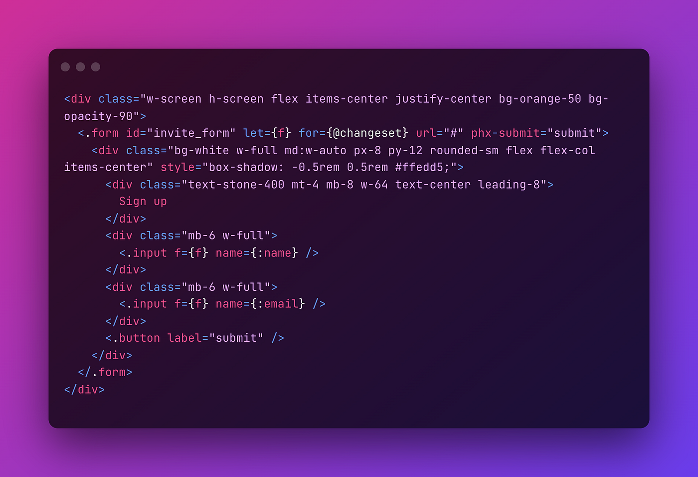
We’re using the Phoenix’ default form function component and wrapped it in a nice looking div. Within the form there are two custom function components: <.input /> and <.button />. Each input element gets its own error message container, so we’ll have to declare that in its definition.
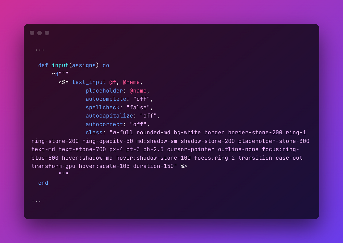
The above simply renders a nice looking input element which will be hooked up to the form function component. When you create a Phoenix project using the CLI, it generates a module called ErrorHelpers. You can then use this in a form with <%= error_tag @f, @name %>. This file can be found at lib/errortags_web/views/error_helpers.ex. Let’s change this to a function component for our LiveView setup (line 6):
~use Phoenix.HTML~
use Phoenix.LiveComponent
And change the error_tag definition to show our awesome looking error message with animation and all:
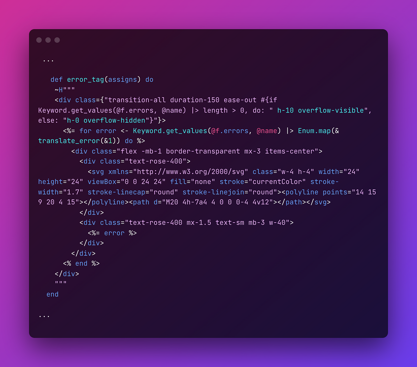
Now we can add the error component above our <%= text_input ... %>. This is only visible when your changeset includes an error.
<.error_tag f={@f} name={@name} />
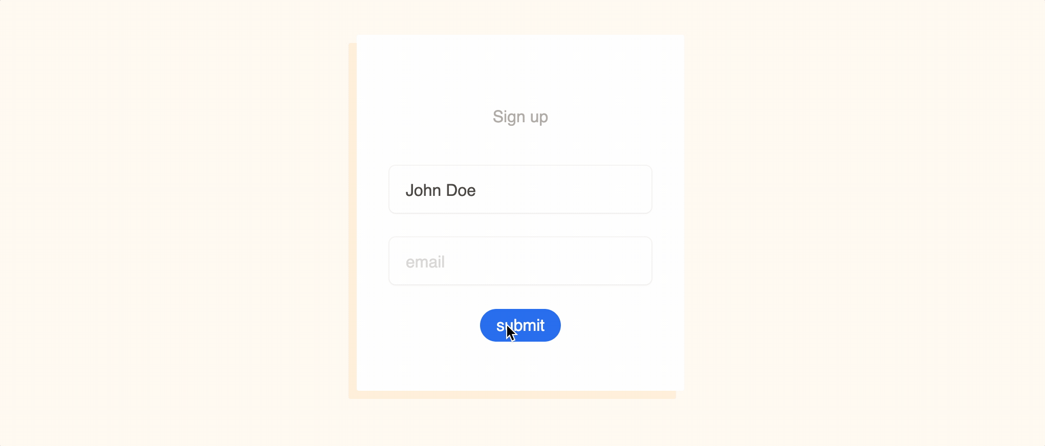
This should be the current result of our efforts:
but we’re missing the red border around the input element!
Communicating between function components
To know whether the form has an error, we need to figure out a way to let our input function component know it has an error. But this logic lives within the error_tag function component and not within the input function component. And we should avoid writing the same code to get errors from the form in multiple places, especially if we’d like to apply this error system to other input function components (e.g. in a checkbox component).
Luckily, Phoenix slots are here to save the day. But we need to rewrite some of our code we previously wrote.
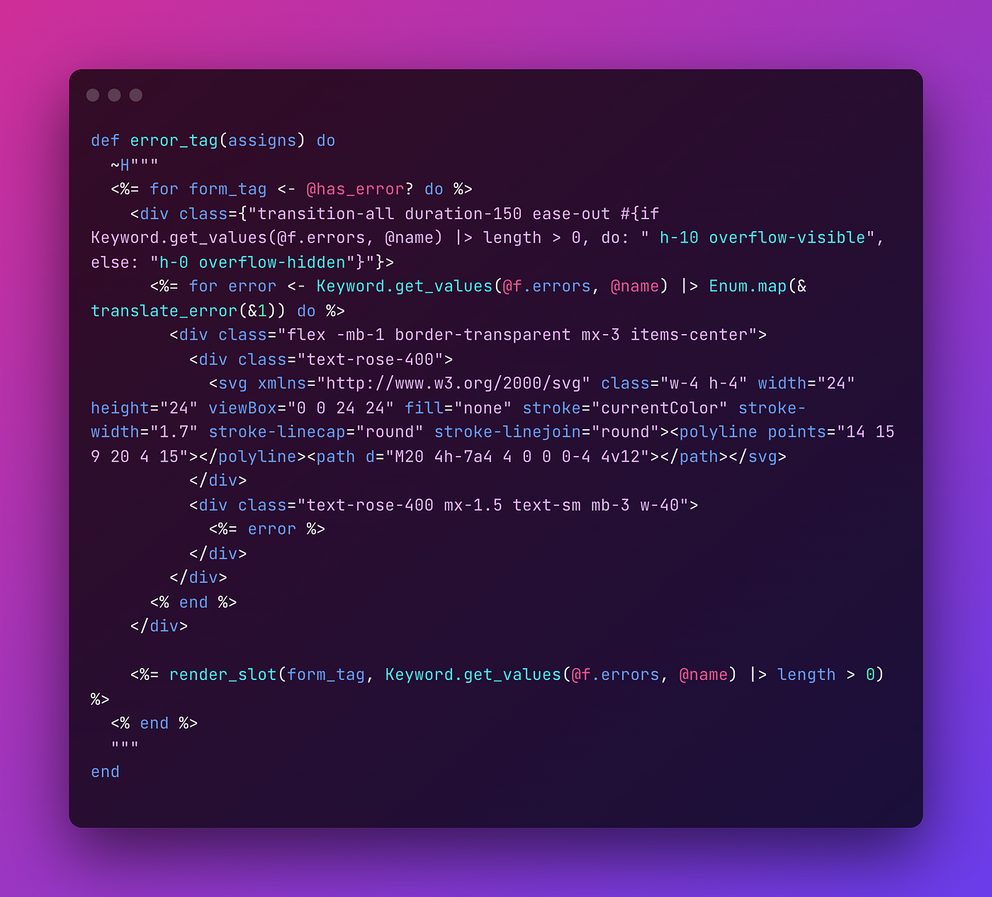
We’ll add a has_error? slot to our input function component and wrap it in this error_tag function component, so we can pass along some data. As you can see above it’s wrapped and used as form_tag. The error html is still the same, but ends with <%= render_slot(...) %>. This is where the input function component will be rendered and includes a second parameter, which is a boolean. In this way the error_tag will remain responsible for letting us know if there’s an actual error, but our input function component will be updated accordingly, like so:
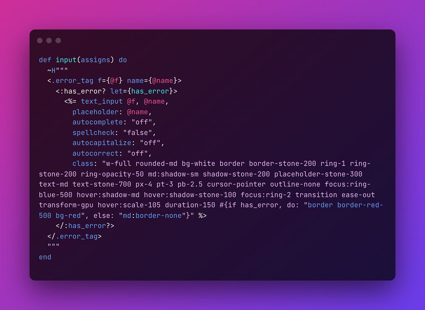
Here we put the input element in the slot. And we also updated the text_input’s class to show a nice looking border around it whenever it gets an error.
There are other ways to achieve this as well, but we’d like to keep the implementation that is used to render an input as simple as possible. And that’s what we’ve got, just use what’s below and we’ll get nice error message alongside with it:
<.input f={f} name={:email} />
If you want to try it out you can find the example code on Github.
